android
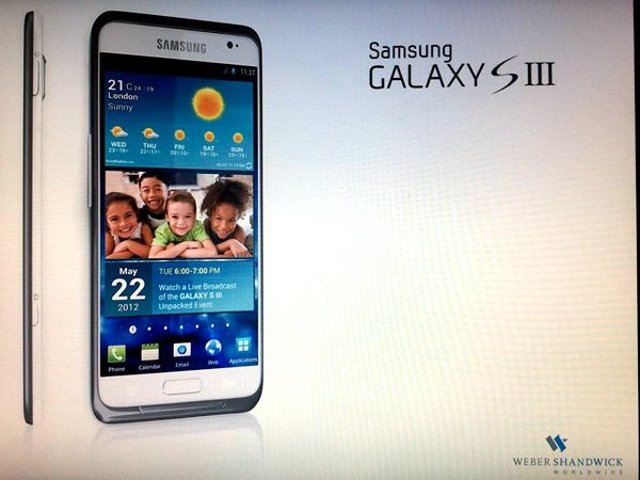
Photo of ultra-slim Samsung Galaxy S3 mock-up shows up on Reddit

While wading through the massive amount of rumours circulating about the Galaxy S3, our need for information regarding this unicorn like device is on the increase. This mock-up while not plausible because of a few minor design inconsistencies is definitely impressive. The first noticeable one is the very fine white border that runs along the bottom up the side of the phone which doesn’t appear to be present on the side view of the phone.
Also, the volume rocker appears to be in the middle of both, the white and the black halves while the power and camera buttons which are visible in the profile view are only embedded in the white half. The calendar entry on the screen dated May 22nd would make any expectant consumer drool in anticipation but we do not see much truth in that little ‘clue’ they have left us.
Among the bits and bobs left in the picture for us to analyse, there are a few things that would not surprise us such as the Ice Cream Sandwich OS with TouchWiz, the only difference being the 5 icons in the dock (like on the Galaxy Note) instead of the 4 on the ICS for Galaxy S2. Another thing is how slim the device is and there is no bump at the back.
Also very attractive on this mock-up is the small almost non-existent bezel. The very intriguing logo at the bottom right of the picture might say a lot as Weber Shandwick is a PR company which are known to have worked with Samsung in the past. While we here at Uberphones in no way say that this is the real deal, it really wouldn’t be very bad if the Galaxy S3 were something like this.