windows
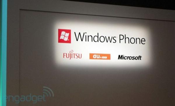
Windows Phone 7 changes its logo

For example the apple logo would refer to Apple, the “tick” would be Nike, so on and so forth. Basically what they’re trying to imply is that the logo of a company or brand is very important as it is what helps to identify them, which is why it’s a bit odd that Windows Phone 7 has decided to change its logo to something different.
It appears that Microsoft has decided to shed the circular frame that surrounded the “windows” logo in favor of a square. We’re guessing that is meant to reflect the minimalist design of the WP7 interface as well as to reflect the tile based system that Wp7 is known for. For now it looks good but we can’t say for sure that if it may or may not cause some slight confusion among users.